
What Experimental Design Actually Means (and Why Your Brand Needs It)
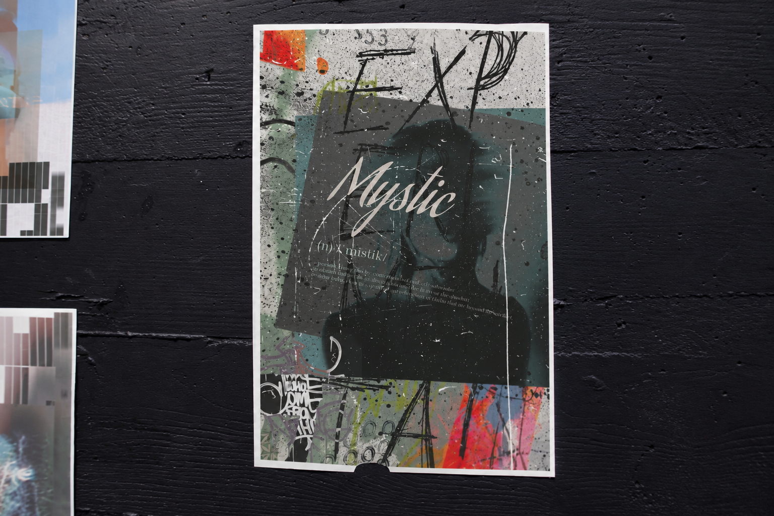
Experimental Design Posters by Cat Dawkins
Okay, be honest with me for a second. Have you ever scrolled through a bunch of branding portfolios back to back and started feeling like you were looking at the same three brands over and over again? Same rounded logo font. Same soft gradient. Same "friendly but professional" illustration style. Same brand video with the same swelling synth music underneath it. You know exactly what I'm talking about.
That's not a coincidence. That's a market that keeps rewarding "safe" over "specific." And honestly, it's the whole reason I wanted to kick off this blog talking about experimental design because I think it's one of the most underused tools brands have for actually standing out right now.
What is experimental design, actually?
Let's clear up the biggest misconception first, because I think it trips a lot of people up: experimental design is not "let's throw out all the rules and see what happens." It's not chaos wearing a creative-director outfit. And it definitely isn't guesswork.
Experimental design is really just this: strategically exploring unconventional ways to express a specific idea. The "experiment" part isn't about the final result being random it's about the process being open.
That looks like:
- Starting with an actual question, like "how do we make this brand feel precise and warm at the same time?" instead of starting with a Pinterest board of stuff that looked cool somewhere else.
- Trying several genuinely different directions instead of just tweaking one safe idea five different ways.
- Being willing to follow a weird material, format, or metaphor if it actually captures what the brand is trying to say.
- Judging the results against strategy does this feel distinct, does this say the right thing, does this hold up everywhere it needs to — not just "do I personally like this."
Basically, experimentation is curiosity with guardrails. Think of it like a scientist running a controlled experiment versus someone just dumping random ingredients into a pot to see what happens. Both are "trying something new." Only one of them is actually designed to teach you something useful.
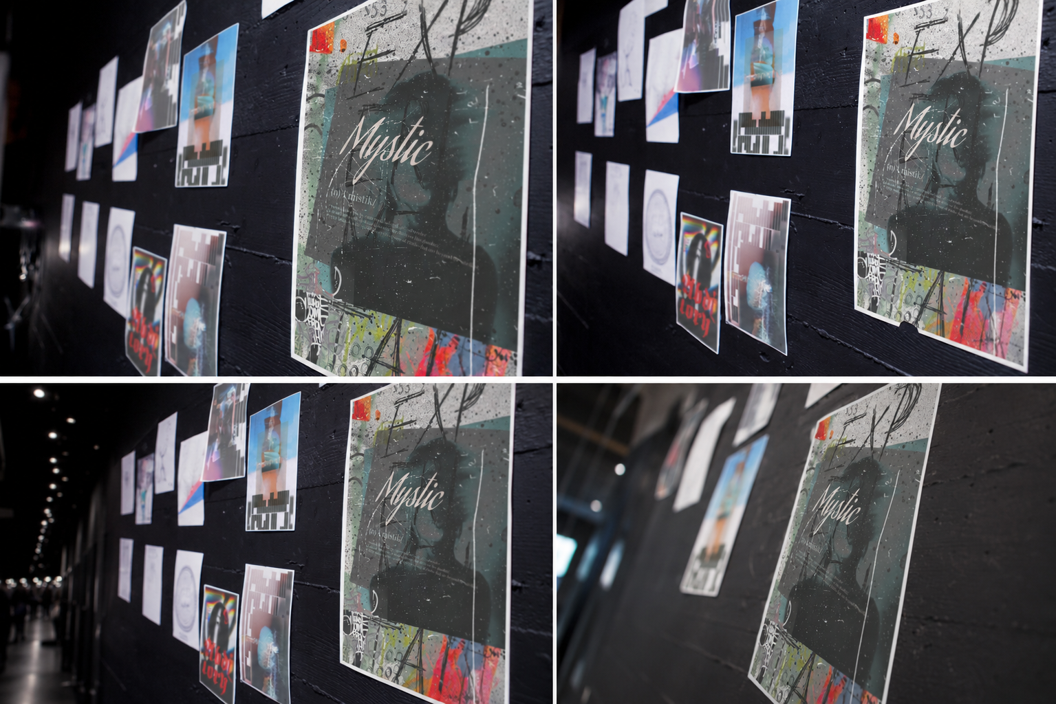
Strategy comes first. The cool visual comes second.
Here's why this whole approach isn't just guessing dressed up in fancier language it's anchored to meaning before it's anchored to looks.
A good experimental process starts with questions that have nothing to do with color or typography yet:
- What does this brand actually believe, and how is that different from what everyone else in the category believes?
- What feeling do we want to own that literally nobody else has claimed?
- What's the most honest, least expected way we could say that?
Only after you've wrestled with those questions do you start exploring visually and even then, you're exploring wide on purpose. Typography that moves or behaves differently than expected. Colors pulled from an unexpected source instead of the category's usual palette. Layouts that ignore the grid everyone else is using. Motion that actually mirrors how the brand behaves, instead of a generic template someone downloaded.
The "newness" isn't the goal here. It's just what happens naturally when you take an idea seriously enough to find its most specific version, instead of settling for whatever's trending this quarter.
Why this actually pays off
I'm not saying "be weird for the sake of being weird." I'm saying concept-driven, experimental design tends to beat conventional design when the market's this crowded and here's why:
It's genuinely hard to copy. When your visual language comes from your specific idea instead of category trends, a competitor can copy the surface look all day — but without the idea behind it, it'll fall flat. The idea is the part that can't be traced.
It reads as confidence. A brand that's willing to look different is basically telling people, "we know exactly what we stand for, and we don't need to hide behind what's familiar." People pick up on that, even if they couldn't explain why they trust you more.
It actually stops the scroll. Familiar design gets skipped because our brains have already filed it under "seen this before." Something different interrupts that autopilot, even if just for a second — and one real second of attention beats ten seconds of someone scrolling past you without noticing.
It doesn't expire. Trend-based identities have an expiration date — usually whenever the trend does. But identities built around what your brand actually means don't go stale the second the aesthetic falls out of fashion, because they were never borrowing the aesthetic in the first place.
So were does that leave us?
A crowded market doesn't need another brand that looks like everyone else, just executed a little better. It needs a brand that's actually willing to ask what it stands for and then find the most specific, unexpected way to say it. Not by guessing. By exploring on purpose.
That's experimental design in a nutshell. It's not the absence of a plan it's a better one.
This is just the start. I'll be getting into real case studies, frameworks you can actually use to run your own design experiments, and breakdowns of brands that nailed this (plus a few that really didn't). If individuality in your brand is something you've been thinking about, you're in the right place stick around.
